The final title animation combines noise, distortion and RGB splits, with the music playing a big part in how it all comes together. I worked closely with its rhythm, timing the visual hits and changes to land just where they needed to.
Sound on for the full experience.
A title with a heavy metal spirit
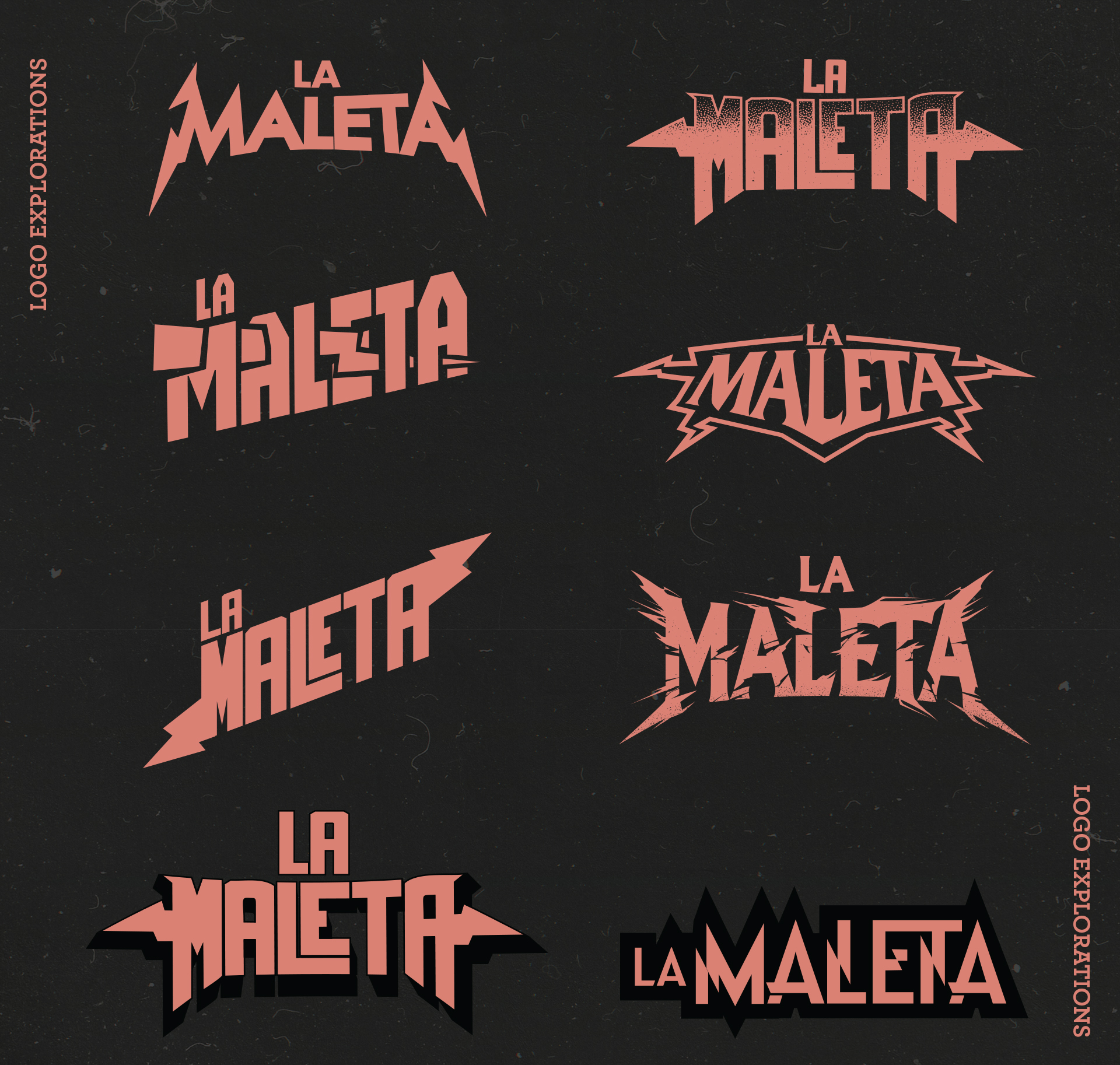
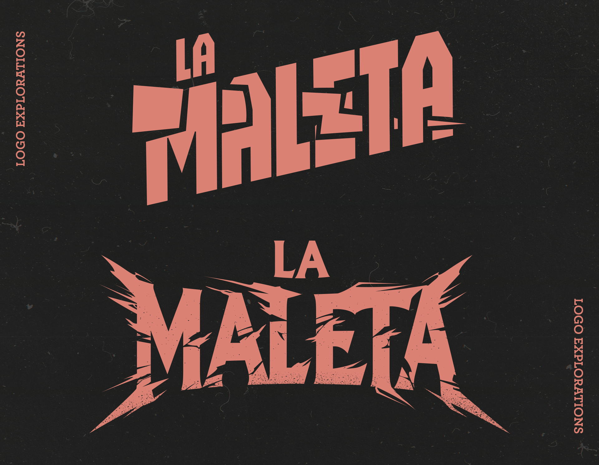
The director’s initial idea was to explore a logo that could belong to a rock or heavy metal band. Needless to say, I felt right at home.
I tried different ways of taking it in that direction: bold, compact lettering, sharp cuts, lightning bolts and some rougher, more jagged versions. We eventually went with a simpler typographic approach, but I wanted to share the exploration and some of the ideas we developed along the way.